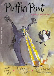
 This is one of the better covers that came with the re-branding in the 80’s – a great cover by Quentin Blake. I’m afraid this cover got some water damage, hence the creases (Too much to restore this time round without messing up the ink-wash artwork).
The inside of these felt a bit disjointed, maybe due to a loss of a house stylist to guide the way. Jill McDonald’s graphics still appear throughout the magazine – old echoes of earlier times.
The other big change – and a big mistake in my opinion – was the change in size from A5 to an awkward A4! Why??